Nike
Free 5.0
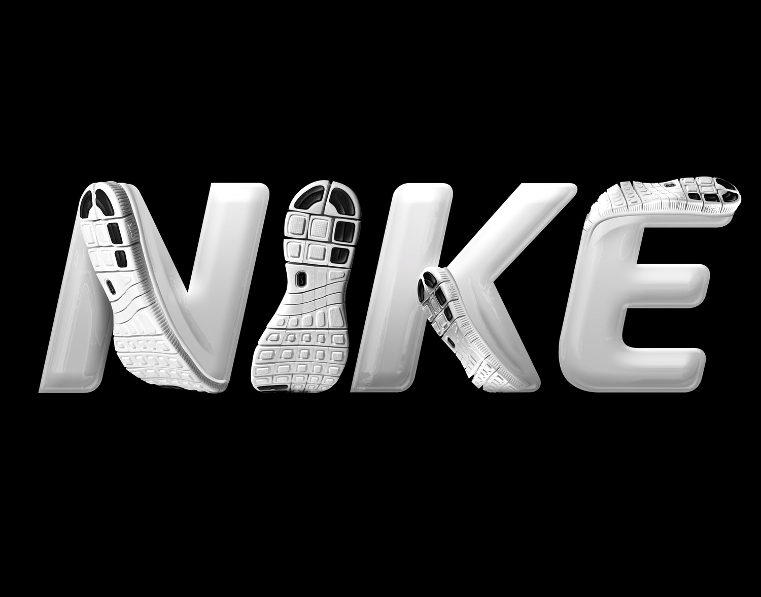
I was commissioned by Nike GBI to develop a lettering concept for use in promotional material related to the global release of the running shoe Nike Free 5.0. The brief was to explore how the behaviour of the shoe's uniquely flexible sole could be expressed through a headline typeface (other than Nike's typical Futura Condensed Bold).
As a base for my treatment I suggested that we manipulate a heavier weight italic version of the typeface Sansa (created by the dutch foundry Our Type) and introduce the shoe's sole behaviour into the curvature of the letters.
Year: 2012
Client: Nike
︎︎︎